PORTFOLIO
The Menopause Boutique
Branding Design

The brief
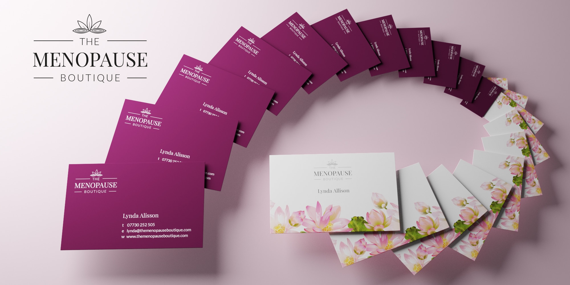
Our client, The Menopause Boutique, had a simple brief when they came to us for a new brand design. They are committed to being a resource for women going through the menopause and are focused on conveying the necessity of natural methods to assist menopausal symptoms. The Menopause Boutique’s offerings are straight-forward – they want to educate and create conversations surrounding the menopause and act as a hub for advice, resources, and useful product recommendations. With the focus being on vitality and nature, The Menopause Boutique wanted this to be represented across all of their branding. The Menopause Boutique recognises that women will not always have the same experiences when it comes to the menopause, so the business card design needed to encompass growth and a relaxing environment.
The result
By putting nature at the forefront of our mood board of ideas, we were able to develop a logo design that recognisably nodded to The Menopause Boutique’s ethos of following a natural pathway when it comes to the menopause. The white text and imagery of the logo against the purple background makes for an aesthetically pleasing business card – one that is comforting to the eye. Furthermore, the use of the lotus flower as part of the logo design suggests that the menopause is an inevitable and natural part of the women’s cycle, as well representing change and growth. The decision to enlarge the text on the word ‘menopause’ emphasises how our client puts the menopause centre-stage and encourages conversations surrounding women’s health. The reverse of the business card connotes freshness and healthy living, since the flowers are lightly coloured and blooming. The overall brand design, we believe, showcases The Menopause Boutique’s mission to become an identifiable and useful resource for women’s health queries and the menopause itself.
