PORTFOLIO
Release Life Science
Web Design and Development

The brief
Based in Witney, Oxfordshire, Release Life Sciences specialise in providing high quality, strategic advice, and efficient implementation. Their goal is to assist life science and diagnostic companies realise their full commercial potential. For Release Life Sciences, it is all about teamwork, which is why they offer interim leadership, management, and resources for a variety of companies.
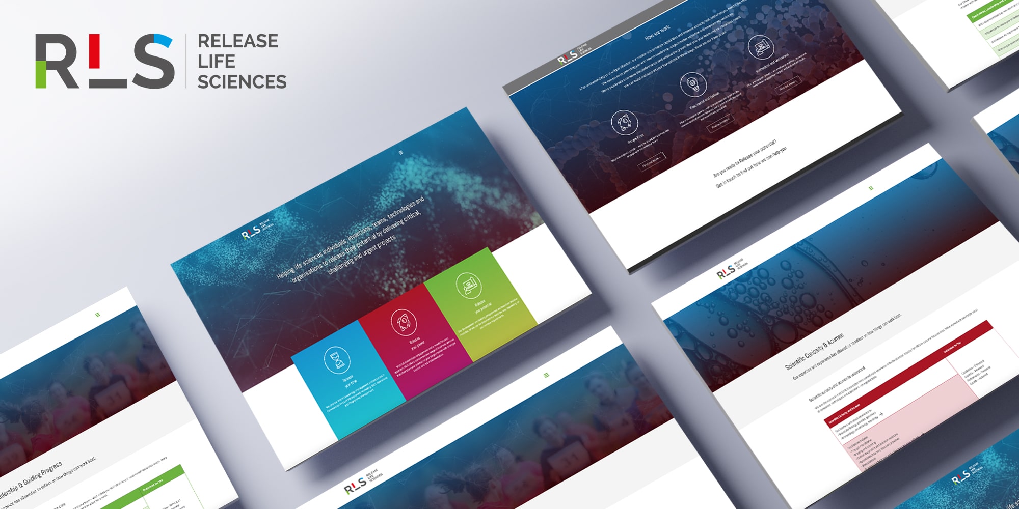
When it came to developing the brief for Release Life Sciences’ branding, brochure, and website design, it was clear that they wanted a logo that not only captured the company’s initials, but a way of signposting their three main offerings too.
The result
For Release Life Sciences’ overall branding and logo design, we settled on the idea of having three primary colours to represent their three core offerings: time, strategy, and potential. By adding snippets of colour into the logo, it meant that Release Life Sciences had a logo design that both conveyed their company’s mission but also made them stand out amongst competitors. Using Release Life Sciences’ three core offerings and the chosen primary colours of green, red, and blue, we were able to create a website that highlights their services effectively and in an aesthetically pleasing way. Release Life Sciences are a company that has continued to expand, and we are pleased to be a part of their journey.

